Daniel Holmes Media
Friday, 17 May 2013
Friday, 26 April 2013
Monday, 15 April 2013
Friday, 12 April 2013
Final Photo's-Concept-One Colour
These are my one color photos, i edited them using adobe Photoshop to take out all color but one bright color.
Wednesday, 10 April 2013
Three Subjects For My Project.
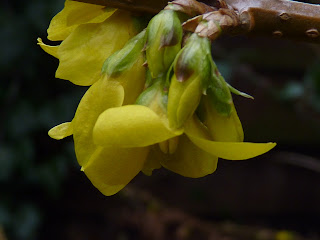
Close-Up
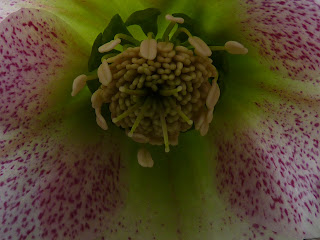
I am going to do close-up photos as my first 4 photos, they will have close attention to detail on objects. The detail will mostly be detail that you cant see when normally looking at it.
Black and White
I will edit some photos of things I have taken and make them black and white. These will be some of the best photos i have taken so that the black and white doesn't mess up the photo.
Landscape
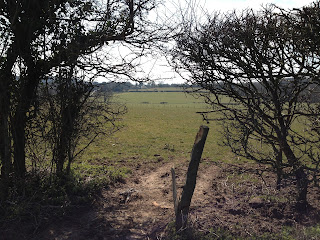
I will post some of the photos i have taken of landscape.
Friday, 22 March 2013
Monday, 4 March 2013
What Makes A Strong Photo
https://docs.google.com/file/d/0B0Kd7AxRACgsQTJMNVA2TkJmcWc/edit?usp=sharing
Friday, 1 March 2013
Friday, 22 February 2013
Rule of Thirds
This is the original photo. This photo is bad because we didn't use the rule of thirds. The subject of the photo is in the middle not to the left.
This is the edited photo it looks better because the subject of the photo is too the left of the photo which makes it look better.
Friday, 8 February 2013
Edited Photos
This photo is improved because I cropped out the image around the focus of the image. I also used the blur tool to blur out the background to draw attention to the model in the focus of the photo.
I increased the saturation of the model using the saturation filter. Then i used the lens flare tool on the eyes of the person in the back of the photo. Then i blurred out the background of the photo. I also made the background black and white.
I increased the saturation of the model using the saturation filter. Then i used the lens flare tool on the eyes of the person in the back of the photo. Then i blurred out the background of the photo. I also made the background black and white.
Friday, 1 February 2013
Can you make a photo look interesting?
This is a good photo because the subject of the photo is clear because of the frame created by the models fingers. The sepia effect of the photo draws attention to the photo.
This is a bad photo because the colours are dull and the model is not making eye contact with the camera.
This is a bad photo because too much is going on in the photo and one model is grumpy and the other model is surprised.
This is a bad photo because the colours are dull and the model is not making eye contact with the camera.
This is a bad photo because too much is going on in the photo and one model is grumpy and the other model is surprised.
Monday, 14 January 2013
Macro Photography.
I like macro photography because it is really nice how it captures all the detail in the photo and it makes even the most boring things look really good. I will have to use a very good camera to try and do this.
Friday, 11 January 2013
Interesting Photos
This photo interests me because the camera angle is very good and works very well. I like the black and white in this photo it makes the photo look very good. I also like the cracks on the window they are black and they add cool detail to the photo.
This photo interests me because it looks funny as the water tension makes it look like the water is draped over his head. The black and white works well for this photo. The water reflects the light in such a way that along with the black and white it makes the photo look really good.
This photo interests me because it is in black and white so it makes the photo look dark or sad. The injuries on his face make me think about what happened to him. Whether or not it was an animal attack or he was attacked by another person.
This is a nice photo because it is of a wolf trying to jump across small icebergs. The angle from which the photo is taken works well for the photo. The only colour in this photo is different shades of blue this is very cool.
This photo interests me because it looks funny as the water tension makes it look like the water is draped over his head. The black and white works well for this photo. The water reflects the light in such a way that along with the black and white it makes the photo look really good.
Year 11 Photography Unit
I am in Caldicot School, I am studying OCR media. I have done two previous units. This is the third unit of my course. In the other two units we produced a film trailer and also we developed a Cd cover and a Magazine cover.
This is Josh and Rhys.
This is Josh and Rhys.
Wednesday, 9 January 2013
Subscribe to:
Posts (Atom)


 This is a photo that has had an effect put on it.


